A couple of summers ago, I toured a wonderful designer showhouse at Flat Rock, North Carolina. As usual, no interior photos were allowed. Being the rule follower that I am, I did not take interior photos. I did take a couple of shots of the stunning exterior but somehow I misplaced the photos. Later, while reading through some material given to me at the showhouse, I decided to check the real estate listing since the estate was on the market. Lo and behold, the listing had great shots of some of the rooms, before and after the showhouse. I hope that you enjoy them as much as I have.
This is the rear view of the house! The front is very similar but I don’t think that it had a fountain. By the way, I love the hydrangea trees. I wish that I had made better notes and that I had not lost my original exterior photos!
The photo above is the “before” shot of the front parlor. Perfectly fine.
The “after” shot does not do this room justice. This room was decorated in neutrals and natural curiosities. I especially like the ceiling treatment and the window treatment. The window treatment appeared to be made of a French grain sack panel with loosely woven linen on either side. The new room has a much more relaxed feel.
The above shot is a “before” of the dining room.
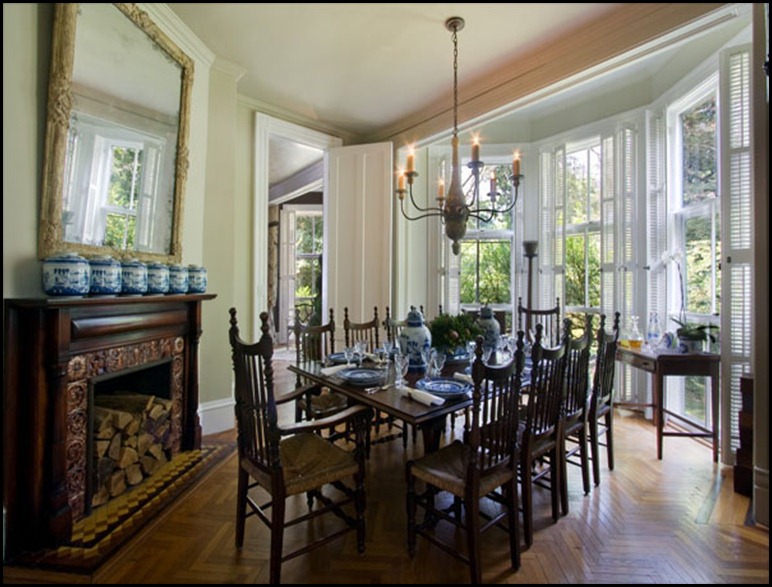
You’ll notice in the “after” photo, the wallpaper has been removed and the chandelier and the mirror above the fireplace have both been replaced with larger scale items. I absolutely love the huge windows in every room. I do remember being told that the house had no central air conditioning because of all of the huge windows. The collection of blue and white pottery is displayed beautifully. Also in this room but not in the photo, was a collection of wooden boxes. They were stacked of course with the largest on the bottom and got smaller going up from the floor. The stack was at least 5 feet high! I really loved that collection too and started my own, but I have quite a way to go to get to 5 feet! To keep the post from being so long, I’m breaking it up into segments. I hope you’ll come back for more.
I’ll be linking to Metamorphosis Monday at Between Naps on the Porch.


What a beautiful home!
ReplyDeleteHi Pat,
ReplyDeleteFirst time stopping by. I always enjoy these before and after shots. This is a stunning home and the neutral look is perfect. I'm a huge fan of blue and white ~ gorgeous collection of porcelain.
Looking forward to following!
Leslie
www.trouverlesoleil.blogspot.com
Because you were a rule follower, you were rewarded with these amazing photos! They are beautiful, and I can only imagine what the rest of the house was like.
ReplyDeleteThanks!
Gorgeous home and oh that floor in the Dining Room is something to swoon over. ☺ Thanks for sharing. -Brenda-
ReplyDelete