Tuesday, January 29, 2013

The Best of the Showhouse

I hope that you have read my last two posts on the designer showhouse in Flat Rock, North Carolina that I visited a couple of summers ago.  As I stated previously, no inside photography was allowed but I was lucky enough to find these photos on the real estate agent’s website since the house was for sale. If you missed those posts, you can read the first one here and the second one here.

flatrock exterior

The house was absolutely beautiful and I have saved the best for last!!

flatrock entry before

The pictures above and below are of the entry before the designers came in. Both were quite lovely.

flatrock entry before 2

There was a vestibule type area in front of a spacious hallway that ran across the front of the house.

flatrock entry after

Can you believe the difference? I didn’t care for the glass top table in front of the fireplace but I loved the bold color and the large ceramic planters were beautiful.

flarock porch

There were porches on both sides of the front door and the porch ceiling was painted the same color as the interior foyer. I also loved the drapes on the porch.

flatrock back porch

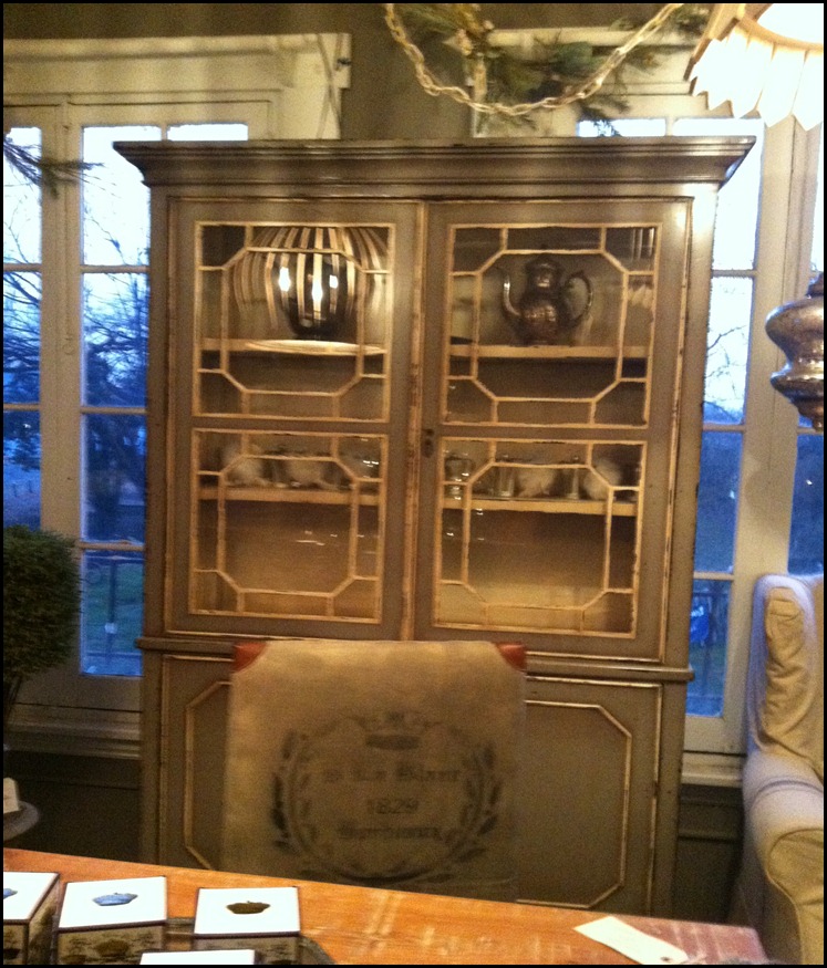
If you scroll back up and look at the first photo in this post, you will notice that the rear entry also has porches on both sides of the door. This photo shows the rear porches. One was decorated as a cooking area. I love the old cupboard used here! In the distance, you can also get a glimpse of the dining area. It was spectacular. There were drapes just like you would have in a dining room which coordinated with the floral table runner over a floor length burlap tablecloth. There was also a candlelight chandelier on a pulley system. No detail was overlooked here. This outdoor room was one of the best I have ever seen. These photos and my lame description do not do it justice. Actually, the rear porches were my favorites of the entire house!  I hope you have been inspired.

I’ll be linking to Wow Us Wednesday at Savvy Southern Style. Click over for lots of great inspiration!

a signature

Tuesday, January 22, 2013

More Showhouse Photos

This is a continuation of my last post of photos from a showhouse at Flat Rock, North Carolina a few summers ago. As I stated in the last post, I followed the rules and did not take photos inside the house. I found these photos on the real estate agent’s website. The house and setting were spectacular. If you missed the last post, you can read it be clicking here.flatrock exterior

I only have two “before” photos in this batch. The first is a bedroom that is obviously a “before”.

flatrock9

Like the other “before” pictures, nothing is wrong with this room. It just has a very different style.

flatrock8

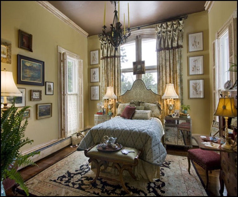
Only a designer would place a bed in front of a window and achieve such a dramatic effect.

flatrock17

The room above is a great updated look using very traditional furniture.

flatrock10

flatrock11

Notice the soft sculpture on the left wall above. It was really cute. It was called “President Obama and His Cabinet”. The tour guide in the room named each cabinet member in the sculpture and you could definitely see a resemblance! Notice, they also left the small sink on the far wall.

flatrock14

The spiral stairway lead to one area of the upstairs. It was not the main stairway.

flatrock16

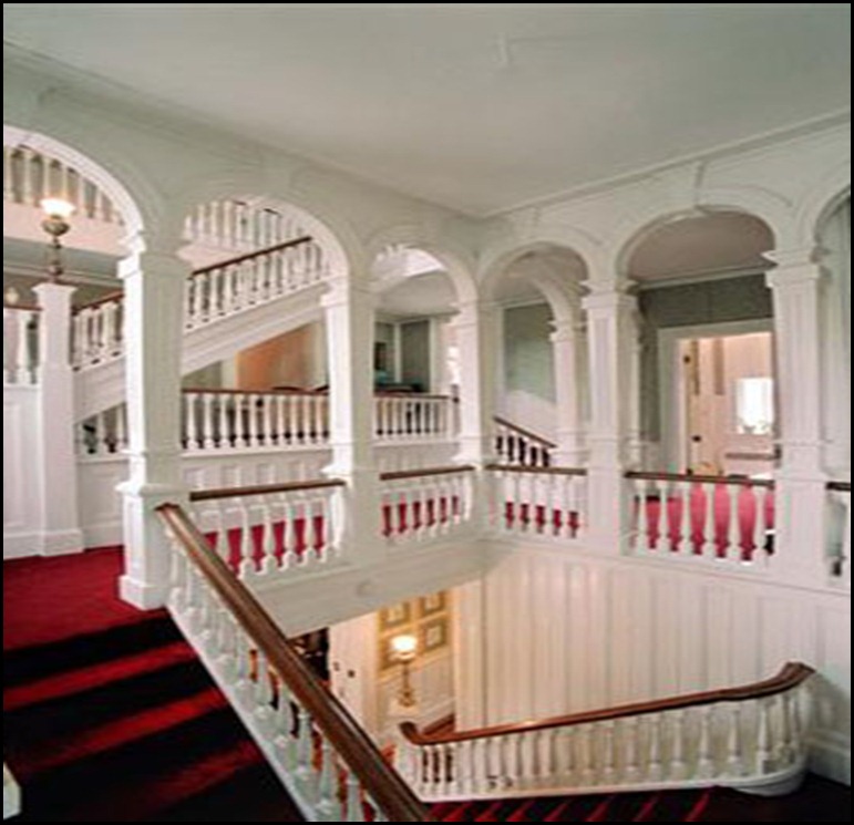
The photo above shows the main stairway. It was beautiful!

flatrock6

This is the rear parlor and you can see the stairway from here. I thought it was interesting that the stairway was not at all visible from the front entry and foyer.

flatrock13

This small bathroom above, was tiny compared to the rest of the house.

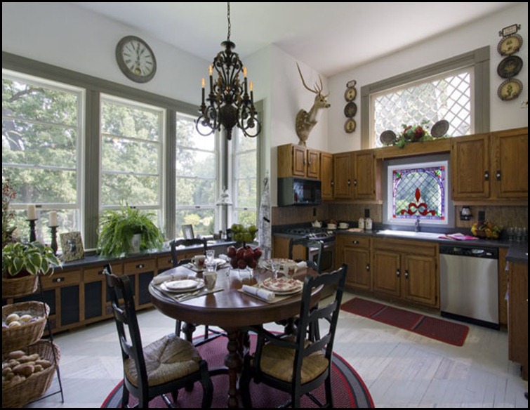
flatrock kitchen before

The above photo is the “before” shot of the kitchen.

flatrock kitchen after

The “after” kitchen looks quite different without a major overhaul. Staining the cabinets a little darker and removing the wallpaper made quite a difference.

I’ll be back with one more post and I am saving the best for last!!

a signature

I’ll be linking to Wow Us Wednesday at Savvy Southern Style. Kim hosts a great party each week. I’m also linking to Metamorphosis Monday at Between Naps on the Porch. Click over to see some great inspiration!
Monday, January 21, 2013

Showhouse Before and After Photos

A couple of summers ago, I toured a wonderful designer showhouse at Flat Rock, North Carolina. As usual, no interior photos were allowed. Being the rule follower that I am, I did not take interior photos. I did take a couple of shots of the stunning exterior but somehow I misplaced the photos. Later, while reading through some material given to me at the showhouse, I decided to check the real estate listing since the estate was on the market. Lo and behold, the listing had great shots of some of the rooms, before and after the showhouse. I hope that you enjoy them as much as I have.

flatrock exterior

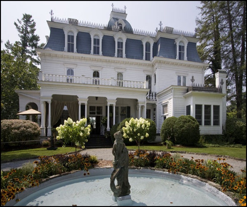
This is the rear view of the house! The front is very similar but I don’t think that it had a fountain. By the way, I love the hydrangea trees. I wish that I had made better notes and that I had not lost my original exterior photos!

flatrock front parlor before

The photo above is the “before” shot of the front parlor. Perfectly fine.

flatrock front parlor after

The “after” shot does not do this room justice. This room was decorated in neutrals and natural curiosities. I especially like the ceiling treatment and the window treatment. The window treatment appeared to be made of a French grain sack panel with loosely woven linen on either side.  The new room has a much more relaxed feel.

flatrock dining before

The above shot is a “before” of the dining room.

flatrock dining after

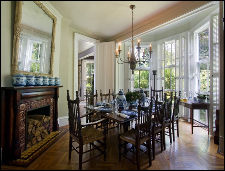
You’ll notice in the “after” photo, the wallpaper has been removed and the chandelier and the mirror above the fireplace have both been replaced with larger scale items. I absolutely love the huge windows in every room. I do remember being told that the house had no central air conditioning because of all of the huge windows. The collection of blue and white pottery is displayed beautifully. Also in this room but not in the photo, was a collection of wooden boxes. They were stacked of course with the largest on the bottom and got smaller going up from the floor. The stack was at least 5 feet high! I really loved that collection too and started my own, but I have quite a way to go to get to 5 feet! To keep the post from being so long, I’m breaking it  up into segments. I hope you’ll come back for more.

a signature

I’ll be linking to Metamorphosis Monday at Between Naps on the Porch.

Monday, January 14, 2013

Whirlwind Trip to Lucketts

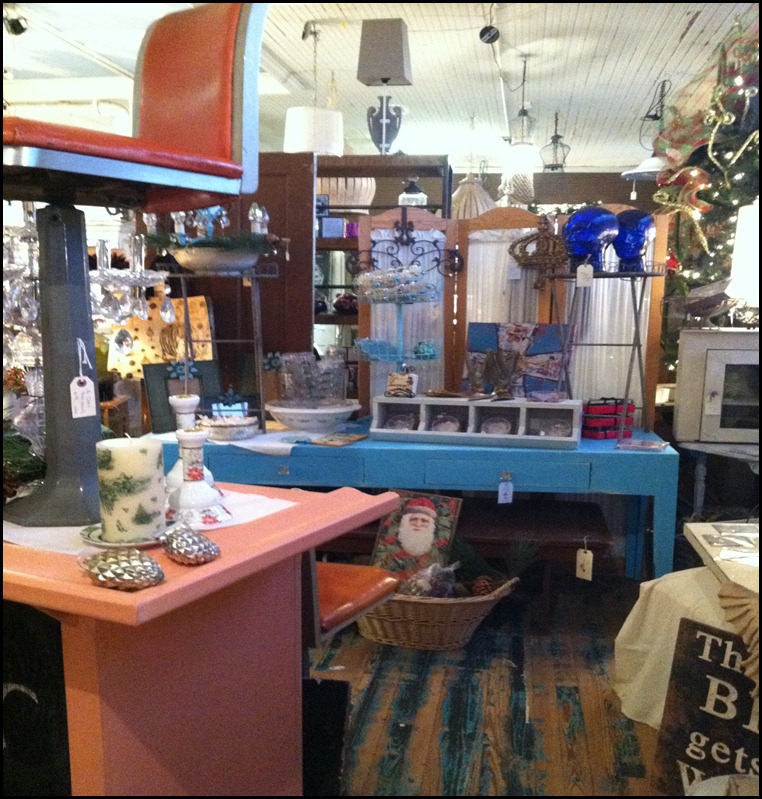
Back in December, I enjoyed a brief trip to the Washington, DC area so that my daughter and I could attend the Middleburg Hunt Review and Christmas parade. You can read about it here.We had a wonderful time. Since Middleburg, is just about 30 to 40 minutes from Lucketts, we had to make a trip there too. Unfortunately, we got stuck in traffic after the Christmas parade and blew in to the Old Lucketts Store about 20 minutes before closing time. I would love to go back another time. I didn’t want to run around snapping pictures like some kind of nut but I did snap a few here and there with my Iphone. I’ll let the pictures do the talking.

Old Lucketts store 1

old Lucketts Store 2

Old Lucketts Store 3

Old Lucketts Store 4

Old Lucketts Store 5

Old Lucketts Store 6

I didn’t buy anything, but I thoroughly enjoyed the experience. FYI, if you happen to go when it’s cold, there was no heat when we were there and the toilet was a port-a-john outside so plan accordingly!

I hope to have some projects ready to post soon.

a signature

I’ll be linking to Metamorphosis Monday at Between Naps on the Porch and to Wow Us Wednesday at Savvy Southern Style. Click over to join the party!

Tuesday, January 1, 2013

Starting Off on the Right Foot

I am looking forward with great anticipation to the New Year! Honestly, 2012 is going to be hard to beat. If you have spent much time on this blog, you know that I love a good rescue, re-do, or any other transformation. I prefer décor with a “pulled together over time” look way more than a “I just went to the furniture store and furnished my home” look. If you, too, love a good transformation, you have to follow the link to read this post:

http://imageremix.blogspot.com/2013/01/the-ultimate-junker.html?showComment=1357074687080#c2927738415865056826

It keeps this whole re-do thing in proper perspective. In fact, it is the best post I have read in a while. Let’s start the New Year off on the right foot with the right perspective.

Happy New Year!

a signature


Share to Facebook Share to Twitter Email This Share on Google Plus