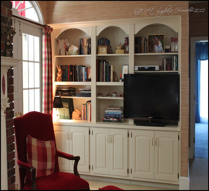
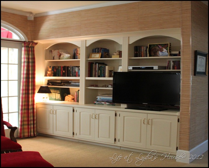
I recently completed an update to the built-in shelves in our den. It was quite an undertaking and made a tremendous difference in the appearance of the room.
The lighter paint color made the room so much lighter and brighter.
If you look closely at the after picture on the right, you can see that I also changed the trim work throughout the room from stained wood to white paint. In addition to the color change, I re-sized the built-ins.
These shelves house our television and we wanted to upgrade to a slightly larger TV. Unfortunately, the TV above was the largest size that would fit into the opening. I decided that a larger flat screen model would fit if the shelves were not so deep. They were more that 20 inches deep so there was room to trim them back.
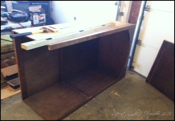
You get a better idea of the depth of the shelves when they are empty. I then began to carefully remove the molding from around the edges. Then I was able to find screws to remove. With a lot a gentle wiggling, the three top units came out.
I carried the top units out to my workshop garage and got to work.
With the unit on its side, I used a square and level to draw a line about 7 inches in from the back. I drew that line on both sides and the top. Then I got out the old circular saw and carefully cut along the lines!!
Next, I carefully pried the thin plywood back off of the part that I cut off and put it on the freshly cut unit. The units were put back in place and I put the screws back in. Now I had a 7 inch gap around the edges to deal with. I used several pieces of molding to clean it up a little. I added a piece of crown molding across the top.
I added another piece of molding at the front edge of the top wall and at the front edge of the walls on the sides.
The molding makes a smooth transition and gives a more professional look.
Now the larger TV can sit on the base and fit in front of the top unit without having to fit in the opening.
These shelves are not particularly styled as they are more functional than decorative but I did pare down a lot of books. We don’t have any books just for looks so they don’t all have pretty white covers or we would never be able to find what we’re looking for!
I have a collection of rabbits and several of my favorites are here.
I’ve had this rabbit tureen for many years.
We are enjoying the fresh look.
I’ll be linking to Metamorphosis Monday at Between Naps on the Porch and to Wow Us Wednesday at Savvy Southern Style.


Love the lighter and brighter look! Beautiful transformation!
ReplyDeleteGreat transformation and fabulous job. I really like the paint job and how much lighter the room looks.
ReplyDeleteWell aren't you the clever girl? I would probably never have thought of this, but it is a great solution.
ReplyDeleteMay I commend you for not doing any weird things to your books! I don't like my books dolled up just for looks either.
I'm amazed and what you can do. It looks great.
ReplyDeleteThat is a marvelous transformation and most of us won't have thought of that at all, ever! Love the lighter paint. Kudos for a great job!
ReplyDeleteWow, what a fantastic re-do and new look! Very impressive.
ReplyDeleteThese came out great. Nothing makes a house look better than built ins.
ReplyDeleteRobin
Robin Flies South
Great new look. I am always amazed at the number of woman with carpentry skills.
ReplyDeleteThose look incredible! I spotted them over at Kim's party and had to come by to see more. :-) They look so custom (which they are!) and the new white paint just makes the entire space so bright. Way to go!
ReplyDeleteVanessa
Hi, I just stumbled across your lovely blog, and I'm so glad that I found you. Your re-do is beautiful, all your hard work certainly shows. I enjoyed reading your profile and feel that we have a lot in common. My husband and I feel very blessed with our little home. It is warm and cozy and a place where friends and family (even a few strangers through the years) know they are always welcome. I am your newest follower. Please accept my warm invitation to visit and to hopefully follow me too. Connie :)
ReplyDeleteI cannot believe that you did this yourself! I am constantly amazed at all of the talent of my blogging friends. What a wonderful change! I agree about books - they are for reading, not decorations - well, O.K., maybe sometimes...
ReplyDeleteThis is the most ingenious makeover I have seen in a very long time. Well done, bravo!
ReplyDeleteThese look great! You are so ambitious to tackle the project of resizing them, but that combined with the lighter paint makes a huge difference (in a good way) in the room. Great job!
ReplyDelete