I have so enjoyed the summer home tour at the Shabby Creek Cottage and wanted to join the party. Click on the link to see lots of inspiration! I have never gotten part 2 of this post done but that is on my “to do” list for this summer!
This was our fourth summer here and we thoroughly enjoyed it. I have done many hands on projects but it has truly been a labor of love. You can read my post about the construction process by clicking here. The rust stains have been removed from the sidewalk and you can see how I did that here. I’ll start with the view when you step inside the front door.
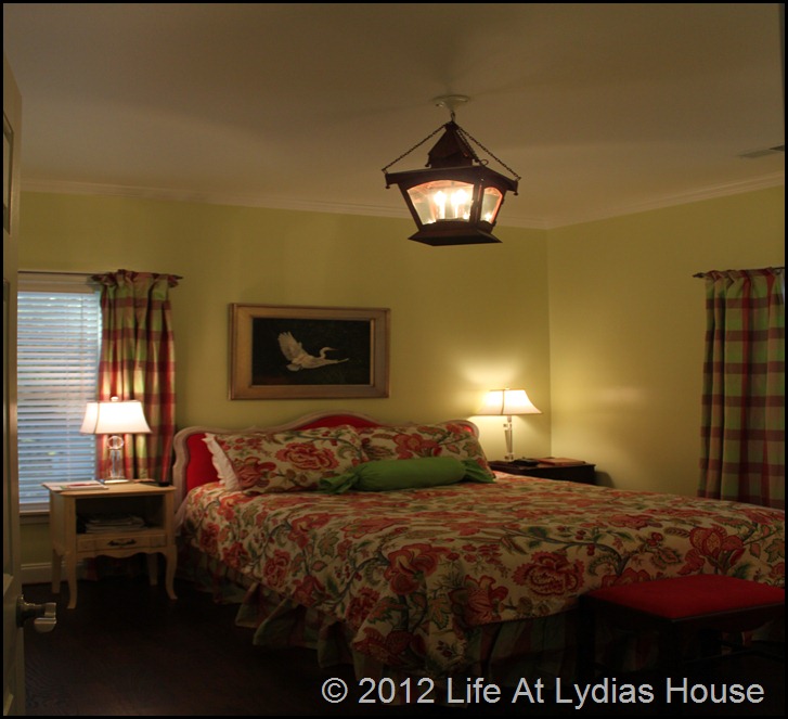
It was difficult for me to get a good picture, but I think you can get the picture! The French doors leading to the screened porch are aligned with the front door so that you can see the lake from the front door. Our main living area is on the lake side of the house, putting the bedrooms near the front door. The master bedroom is to the right. Warning……I LOVE color. This is NOT a neutral house!
The furniture was all bought second hand with the exception of the mattress and box springs. I made the custom bedding from Robert Allen’s Summerlin fabric. The drapes and bed skirt are silk. I’ll do a post later on the headboard which I purchased at Scott’s in Atlanta.
The light fixture is one of my favorite things and you can read about how I made it here.
The comfy chair in the corner is a hand me down that I re-upholstered in a coral colored upholstery velvet. I used the same fabric on the headboard.
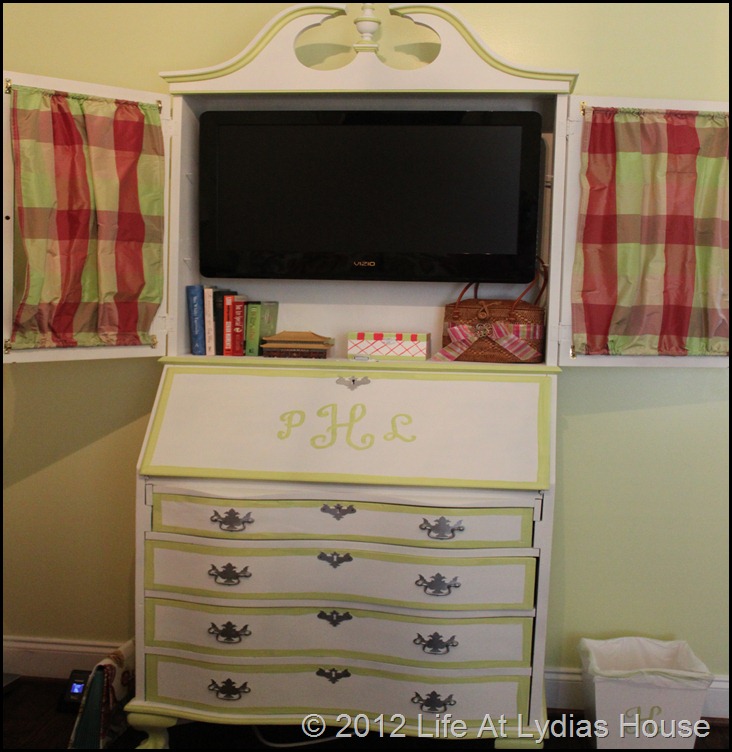
The painted secretary serves multiple purposes: storage, a desk for bill paying, and it houses the television. You can read about that project here and here.
Because of the small footprint, it was hard to get good pictures, but the master bath is done in the same colors and fabrics as the bedroom.
The guest bedroom and bath are directly across the hall from the master bedroom. All of the furniture in this room was either hand me downs or purchased second hand with the exception of the mattress and box springs.
The settee and floor lamp were two fun projects that you can read about here and here.
Because the guest bath also serves as the powder room, I added a shower curtain made of very loosely woven linen in front of the glass enclosure to provide a little separation.
The framed humming bird prints were vintage prints that I purchased at Metrolina Antiques in Charlotte. I considered buying all of the prints that she had and using them as wallpaper but changed my mind.
I asked the builder not to install any bathroom mirrors and I purchased framed mirrors instead. I think that little detail adds a lot of interest.
This is my favorite piece of granite in the entire house! It is honed instead of polished. The texture looks like leather but it is very soft to the touch. Because we only needed a small piece here, we were able to use this which was actually a remnant.
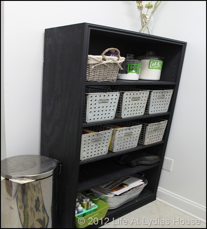
The laundry room is nothing fancy but it is very functional. It is the only white room in the house!
I painted the ironing board cabinet with chalkboard paint to use for shopping lists.
The vintage locker baskets were purchased at a flea market and I built the shelving of plywood so that everything would fit. Since we have a considerable amount of company here, the idea was that guests could put their things in the locker baskets.
Because the hallway is so narrow, our “entry table” is at the end of the hall but it provides a place to drop keys and phones. You can read about how I built the table from parts of my grandmother’s piano here and you can read how I made the slipcover for the lampshade here.Our main living area was designed to blend the indoors and outdoors together.
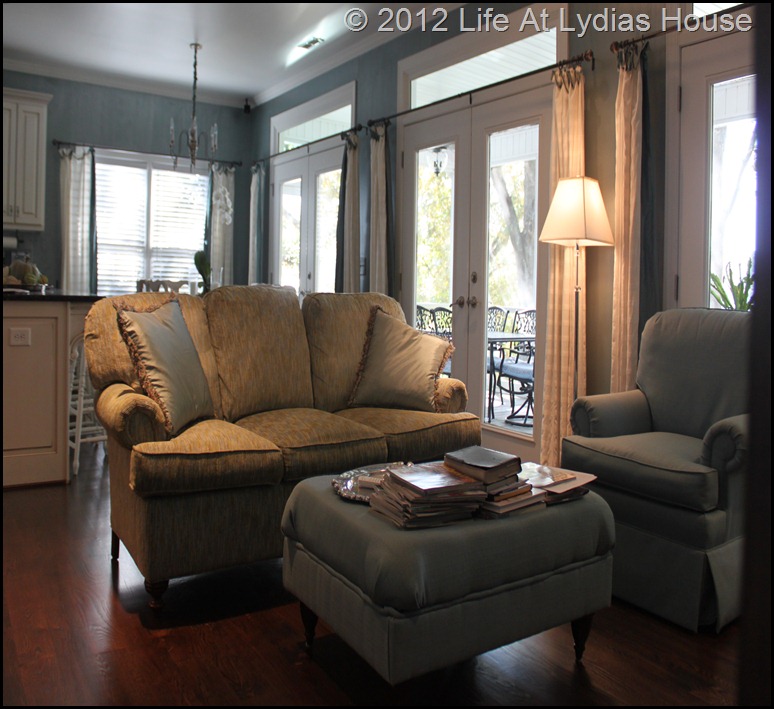
The den area is to the right.
The kitchen and dining area are opposite of the den area. Three sets of French doors open to the screened porch.
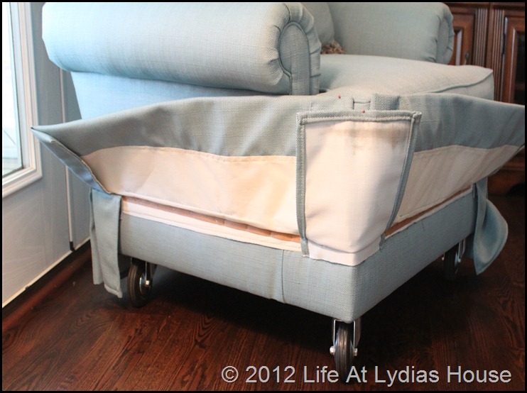
Because this club chair sits in front of the doors, I removed the feet and added swivel casters with rubber wheels. That makes it very easy to move it around without damaging the hardwood floors.
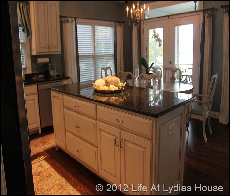
The kitchen is also on the small side but very functional. I added the under cabinet lighting to the custom cabinets.
To make the most of the small space, I chose to use drawers instead of cabinets with doors.
I also used some drawers in the island.
For the kitchen sink, I chose a large, extra deep single bowl. It is great to have a sink that is big enough to wash things in.
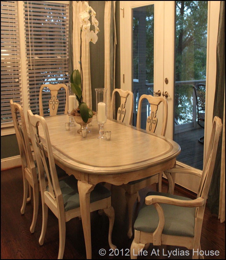
The dining area adjoins the kitchen.
The dining furniture was handed down from my mother. You can read about how I painted it here.
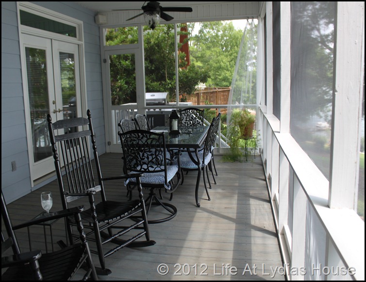
The screened porch may be our favorite space of all. You can read a post I did about it here. You can see how I made the lamp here and you can read about the black server that I rescued for $20 here!
When the weather is nice, we eat our meals here.
That’s it for the main floor. This is our view from the porch.
As you can imagine, we always enjoy our time here.
I hope that you are enjoying your summer. I certainly am.

















22 comments:
Well I am in love with your beautiful home! Every detail, you have given it your love and it shows. The view is amazing, I would love to sit on the porch and read and relax and look at the beauty. Thanks so much for sharing with us, I found your link at Met Monday.
So cute. I like how the cottage looks like it has been there for 50 years even though it is new.
Your cottage is so beautiful!
Pat, your home is so inviting and you have implemented so many great ideas! I especially love the casters on the club chair. Brilliant! And all your color is fabulous. That view just wows. What fun times you must have here. Thanks for stopping over at Quirky Vistas and leaving me a sweet comment! I appreciate it. I'm now following. Hope you'll stop back and follow as well if you like!
Liz
Thank you so much for the tour! Your cottage is just beautiful!
Hugs, Penny
This is absolutely adorable. I would love to hang out and look at that lake.
Wow! What a great view when entering your summer cottage! I love the way you used color throughout. All of it is beautiful and that kitchen is just divine!
What a charming home! Love all the colors, and that settee is too cute! Linda
Your cottage is so charming. I love the way you decorated it. Thanks so much for stopping by my blog, Pat!
I like this blog its a master peace ! .
Wow...just wow. Beautiful cottage.
Your cottage is fabulous - especially that amazing view! Great idea to put that chair on casters and to have the builder leave out those horrid builder grade mirrors!!
Kelly
Your cottage is beautiful! Thanks for visiting my blog
Have a nice week!
Your cottage is beautiful. Love the colors throughout and what a view. I would sit there all day.
What a CHARMING cottage! I love it all, but especially your kitchen, eating area, and living room. Just beautiful.
I'm delighted to be a new follower, Mary Alice
I found your beautiful double porches via Pinterest and came by the visit! I love your home and am now a new follower!
I am so in love with your summer home, you did an amazing job, just amazing.
Jan at my new blog, The Pink Geranium
What a gorgeous home! I'll be featuring it tomorrow, thanks for sharing!
How beautiful Pat! Our friends have a second home at the Lake of Ozarks and it's a joy every time we all go down for some fun in the sun. Even though everything you did was amazing and looks great, my favorite idea was the chair on wheels. Simply genius.
Pat, I don't remember clicking on your blog before and I love it! Love the philosophy that you shared in the About You section too. I'll be snooping around here. :)
Come visit me if you have a chance. I shared a friend's house this week and you too have similar style.
You are such an amazing seamstress! I adore all the colors you used. What a gorgeous home.
How did I ever miss this post? What a beautiful space you've created. I'm so glad that there are still some people who love color. Neutral spaces are pretty, but color done well really rings my bell. I'd say you've definitely done color well here!!
Post a Comment